This summer Giorgio Armani has released a few mini collections focusing on lips and eyes. The new Gloss d’Armani shades from the Skin Lacquers Collection was featured last month
here. The latest release is their Eyes to Kill Aqua collection featuring six new Eyes to Kill Intense shades, waterproof mascara and eyeliners. I ordered all six of the Eyes to Kill Intense shades from
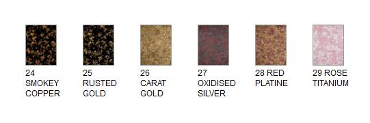
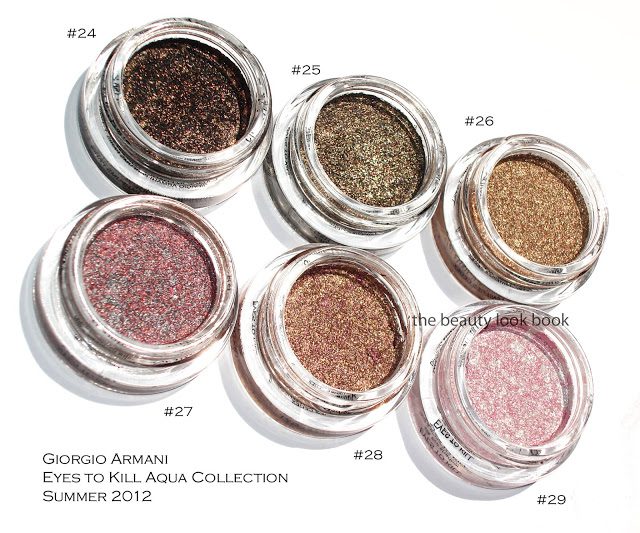
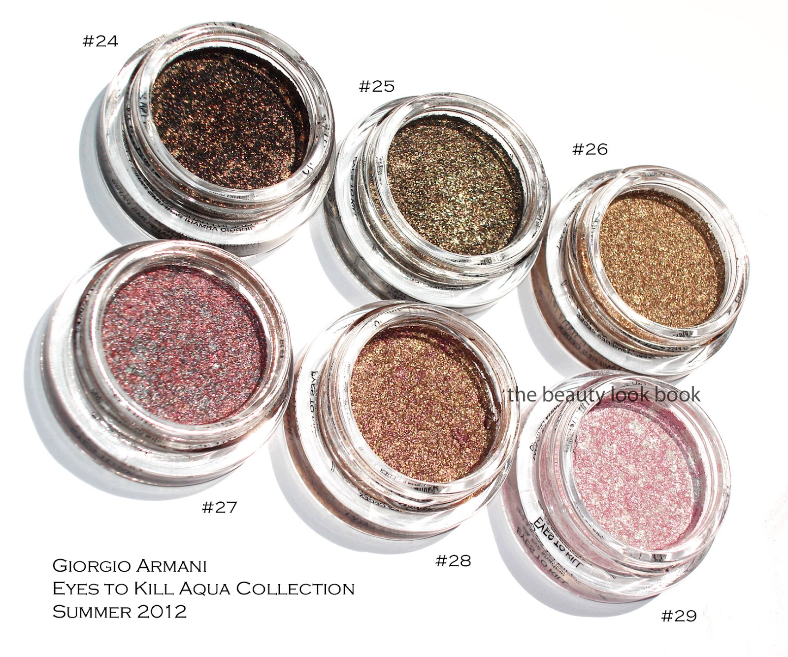
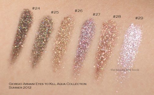
Saks sight unseen ($32 each for 4g/0.14 oz, all listed as limited edition, made in France). The colors looked amazing online and I am happy to report these indeed are stunners. The newest shades are #24, #25, #26, #27, #28 and #29. Some sources have actual names for these. For Armani, I always reference the numbers since the names are rarely printed on the box or packaging for shadows or lipsticks or glosses. Here is the lineup from Saks online and then one of my photos below. I have to give the thumbs up to Armani and Saks for improving their online swatches for these.
I’ve reviewed the Eyes to Kill Intense formula before, but to recap for those new to these shadows, Armani’s Eyes to Kill Intense are a potted hybrid cream/powder eyeshadow. The texture is spongy and almost-cream like but not quite. They are indeed intense in pigment and sparkle. Most contain a complex blend of colors almost like a kaleidoscope making them multidimensional. I like to think of them as a pumped up version of MAC’s MSFs but for the eyes and in a cream formula. Armani boasts that these are long-wearing shadows with 24 hour lasting power. I have never worn any type of makeup for 24 hours straight, but I do find the lasting power to be stronger than the typical shadow. If I don’t touch my eyes at all during the course of a regular day, I find that they last without fading.
The formulas are easy to blend and layer under and over shadows. I do find layering a powder over these will sometimes make the Armani cream shadow fade a bit. If you want to layer over these but still want to maintain the sparkle intensity, I recommend you pat. These aren’t emollient enough for me to be a base though.
Compared to Chanel’s Illusion d’Ombres, Armani’s Eye to Kill Intense last longer and have a less bouncy feel in texture. Although some are more sparkly, I find Armani’s easier to wear and pull off for everyday or for evening. Now onto the colors:
#24 is a blackened gold sparkle. It’s beautiful for a smokey liner or smokey eye. What I love about these is that they the pigment is easy to control by layering.
#25 is another black-gold sparkle but with more of a lighter khaki base. On me it pulls slightly olive because of the gold tones.
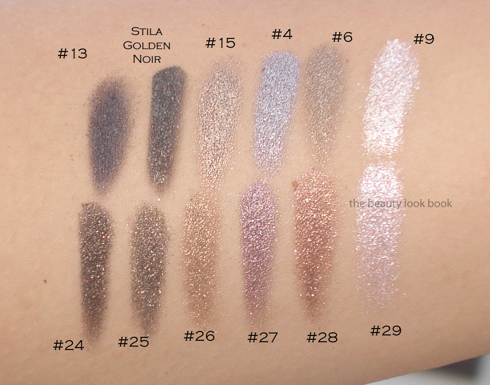
#26 is a beautiful warm gold. Some of you may wonder how close this is to #5, #6 and #15. It’s close but slightly less khaki and more golden/warm. I’ll show a few comparisons below.
#27 is a complex silver-taupe-red sparkle. I expected a silvery-taupe but mixed together it pulls more purple on my skin due to the red metallic streaks.
#28 is a gorgeous gold with burgandy/purple blend. It’s what I wanted NARS Kuala Lumpur to look like on me (which was way too warm/red). This has just the right amount of copper and burgandy blend to work for me.
#29 is a pale frosted pink-white pearl. I would say if you have either #8 or #9, this might be too similar to justify owning for you. I do find it’s brighter and whiter (even with the pink veins) so it’s a bit more contrasted on my skin (especially with a tan). This one and #28 arrived a bit cracked/separated from the container. If you search other reviews you will see the packaging comes with a black insert which you can use to press down the product. I used those to try and press down the shadows and fix the cracks a bit.
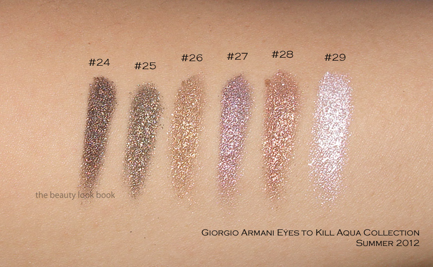
Now swatching these will definitely vary depending on what kind of brush or how much pressure you use. I’ve swatched these a few different ways and under different lighting to show the complexity. Messy Wands has swatched these on her skin (which I believe is lighter than mine), definitely check out her blog to see how they look on her.
Swatch set #1 on the arm:
Swatch set #2 at an angle so you can see the sparkles shine in the sun:
Swatch set #3, bigger swatches blended:
These were all swatched without a base and with a variety of cream shadow brushes (from MAC, Bobbi Brown and Becca). Note that while these look uber-frosty and metallic, they are wearable on the eyes without being too frosty. At least on me. I only had time to swatch a few comparisons to other Armani shades, sorry my schedule can’t accommodate more comparisons right now. I do find these relatively unique compared to the existing Armani lineup. Two views below.
Overall a huge thumbs up. I do think #24 and #25 are very similar and you definitely don’t need both. I prefer #24 because it’s darker and more intense. Have you checked out the new Armani Eyes to Kill Intense shades yet? Thoughts? Did you pick anything up?


This is the first time I'm seeing these new ones, gorgeous 🙂 I like #27 and #28.
Wow I am so in love with these! Thank you for the gorgeous swatches!
I Like the 25 und 27. Beautiful colors!
I love #24!
I haven't checked them out in person but I am planning to, I am absolutely loving #28 – so gorgeous!!! Thanks for the review and very helpful swatches 🙂
Oh no, this is dangerous as I really like a number of these shades. #24, #25 and #27 in particular are calling to me. I'm actually thrilled to see a collection that excites me. Thank you so much for sharing Sabrina.
Love them all!
I adore these – #24 and #27 are gorgeous.
Love all the new colors! I like the GA Eyes to Kill eyeshadows, I need to get them out and use them more often.
#24 and #25 are on my to-get list for sure.
oo 25 & 27 look right up my alley! I may have to go ahead and buy them.
25 & 27 look great! I may just have to buy them. 🙂
Great Swatches!
#29! <3
I have no ETK atm, but thanks to your swatches, I might be getting at least one soon. I think I might get #27.
I like the shadows' glittery effect.
You really have the loveliest swatches. I must work on mine 😛 You make me want everything you post on here!
Wow these colors are gorgeous!
Smokey Copper and Oxidized silver are my favorites :)Ahh how I wish these would be available in SIngapore too..
Gosh, #25! I love how the combination of black and gold lends to an olive effect.
Thanks for the lovely swatches. These look beautiful! I can see a trip to the Armani counter is in order! 🙂
I love #24 and #25
Are the shades true to pan and real life? Coz they look a little over exposed, coz of the sun…
Hi Bun Bun,
I actually have all these shades, and I'd say Sabrina's swatches are reallyclose, but a bit on the warmer and maybe slightly lighter side. Of course, she is a good deal tanner than I am so the colours will show up different on her complexion. On my NC 15-ish skin, shades 24 and 25 are dark and sooty looking; they're pretty much black with shimmer that shows up in low lighting and sunlight. They're gorgeous, but under normal lighting or in the office, they just look kind of sooty on me. If you have MAC's Gilt by Association or Sunday Riley' Fools Gold, you'll know what I mean. Messy Wand's swatches of these two give you a good idea of how they'll show up.
Shade 26 is almost a golden caramel on me. As much as I love to look at it, it totally washes me out and looks terrible.
Shades 27, 28, and 29 are pretty accurate, except my 26 is slightly more silvery/grey/cool than hers and my 29 is a bit more pink and frostier.
I hope that helps. S
I was eagerly anticipating swatches of these shadows…thanks for sharing! I totally want #24…I am a die-hard fan of #15 and think that #24 looks like a bit darker version (without getting too smokey). Can't wait to pick it up!
–The Beauty Professor
I want them all! <3
While these are undeniably gorgeous, I just want to buy them to look at them. I don't think I'd get much use out of these though–they're a little too shimmery bordering on metallic and I pretty something more subtle that I can just do a quick wash of color over my eye and go
Thank you for the lovely swatches! I picked up #27 last week, but your pics made me realize that the one I really wanted was #28. Thanks Nordstrom for free shipping (and free returns).
OK, so I'm wearing #27 today and it is what I wanted the Chanel Illusion d'Ombre in Illusoire to be. On me, GA ETK in 27 is a sparkling reddish-purple-taupe that is just gorgeous and really makes my hazel eyes look more green. I'm so glad I bought it by accident! (BTW, I'm fair with pink undertones and a fair share of beige freckles.) Thanks again for the review.
Glad you found two new loves!
Sabrina – you're a genius when it comes to swatches and pix!! Can you please comment on which one would be a very close dupe to the old ETK in #15 Copper/Black. Thanks!!!
I don't find any are really comparable to #15. I suppose 24 would be similar because of the copper and black tones, but 24 is deeper and smokier. Think of it as black is the main colour and the copper is the sheen and shimmery effect, so the black is lightened and warmed up a bit by the copper. I only see this in sunlight and low light, though. If you're fair, it's going to show up more black than anything under normal and office lights.
25 is more khaki than 15 with gold bits, and 26 is more of a caramel bronze gold.
Sorry for the delay, I think #6 is closest to #15 but there isn't anything quite like it.
If you can find #15 I recommend you pick that one.
Oh Sabrina, I already own 10 but this post made me want to get 5 more!
A funny sidenote though… am I the only one thinking that Armani mixed up their summer and fall collection names? The Bronze collections have colors that are all acqua, and the acqua collection has bronze colors… hmmmmmm
Annie, I was thinking the exact same thing! The names for each collection should have been switched, lol. Their official summer release wasn't very summery at all!
Massive thumbs up for this palette, I wouldn't know which one to pick.. but I think your pics are great too, nice post!
hi anonymous, i think my skintone is close to yours. how would you compare #24 to #25 on your eyes? i'm hoping to apply lightly and blend them to be very subtle on eyes. would they look any different applied like this on you? which one do you think is less sooty?
does #26 make your skin look sallow? a prob which i've with warm golds..
let me know, thanks in advance!
hi sabrina,
lovely swatches! many thanks
#25 pulls more greenish/khaki on me, but I do have skin that tends to bring out olive tones. I think #25 would be less sooty.
Neither make the skin look sallow. I think you could go with either shade personally.
Hi Eunice and Sabrina,
"Anonymous" here! Sorry about leaving myself anonymous, Sabrina. I always visit your blog, but this is my first time commenting.
Eunice, if you're my coloring (B.E. Golden Fair, Nars Gobi, MAC NC 10/15, Bobbi Brown Warm Ivory/Sand, etc.), 25 is slightly more wearable because of its khaki undertone. If I'm wearing it during the day as my main lid color, I'll buff it with my fingers a little to sheer it out and bring out the golden sheen. 24 still looks rather black-ish when I do this. But I think what makes these shades so stunning is their intensity. When you sheer them out, some of the allure disappears. Best Things in Beauty and Mostly Sunny blogspots also have swatches of these shades.
26 does make me look sallow and maybe a little tired, as do most warm golds, browns, and some khakis. I'm mixed French/Asian, so my complexion is olivey yellow with just a hint of grey, if that helps.
If you collect these eyeshadows, you can always wear them as liners or crease colours! For me, 27 and 28 just suit me better. Armani's press release did state that shades 24, 25, and 26 are meant to "enhance the tanned skin tone" and 27, 28, and 29 are "designed to reveal the healthy tone of skin with ice metal tones that refresh the eye," so maybe that's why. Good luck!
To the Armani Gods,
Please make 24 permanent. Or, better, this entire range! We need more eyes to kill, there just aren't enough shades!
Rose titanium looks phenomenal! Wonder if it would look too pink on my pale pale white skin?
Just picked up #25, absolutely stunning! #25 is a little too dark for everyday wear but equally gorgeous!