
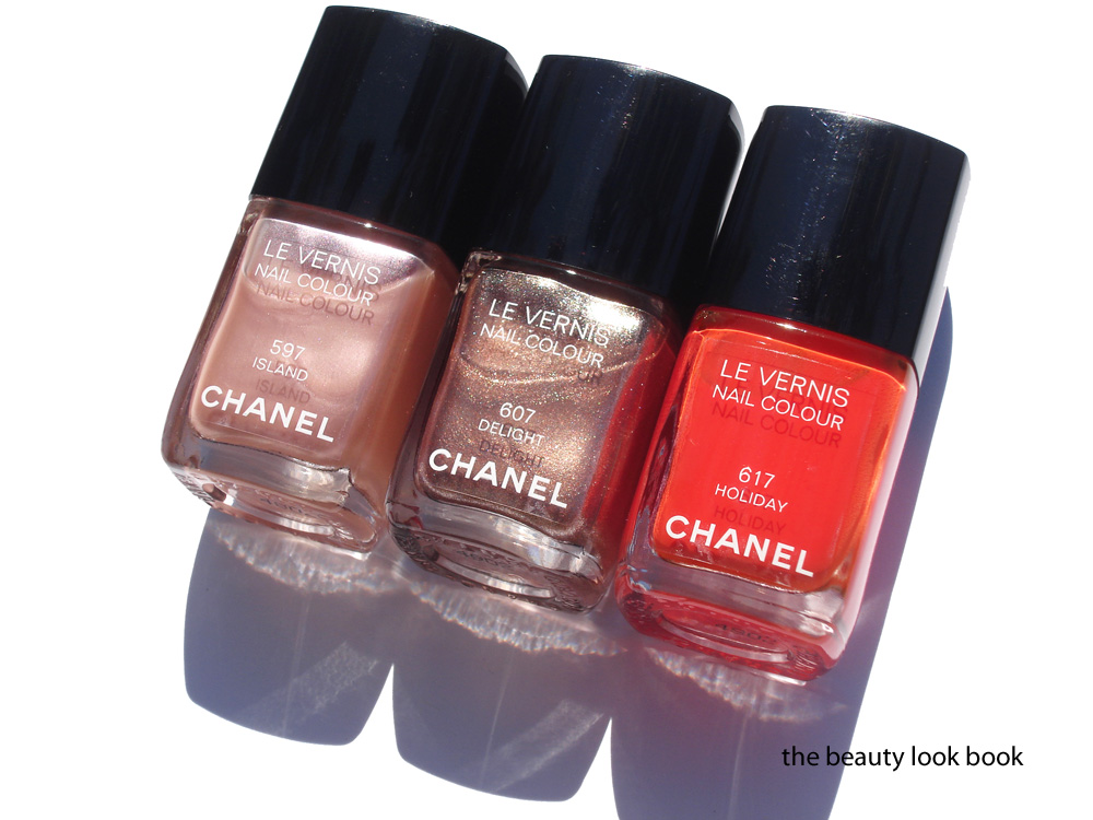
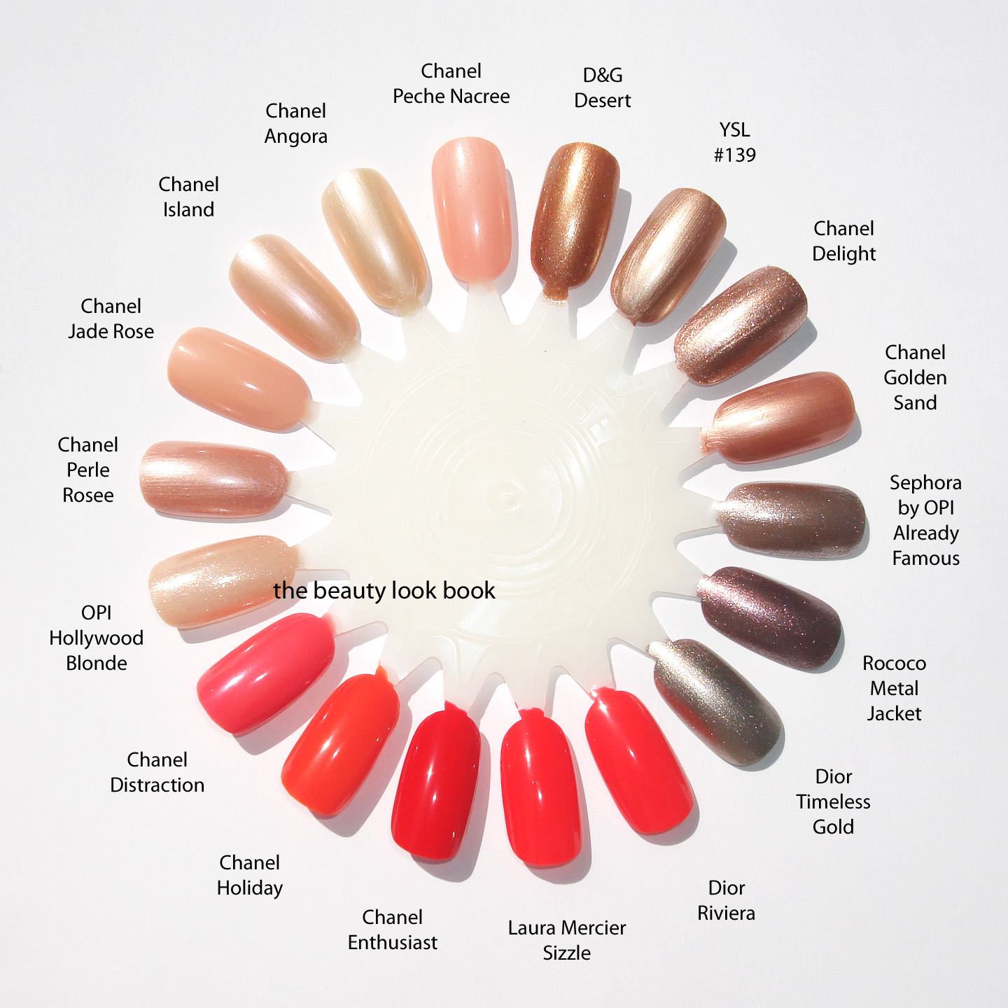
Chanel Summer 2012 has started to trickle in at counters. I’ve found the summer items at Macy’s in Southern California (I hear Nordstrom Seattle has it as well and Bloomingdales in NYC) I think you can expect to see these at all Chanel counters in the upcoming week. Late Friday evening I came home with the three new nail polishes in Island 597, Delight 607 and Holiday 617 ($26 each). They are perfect for right now and for the upcoming summer season. I found it nice to see a little variation from the recent releases we’ve seen from other brands this spring.
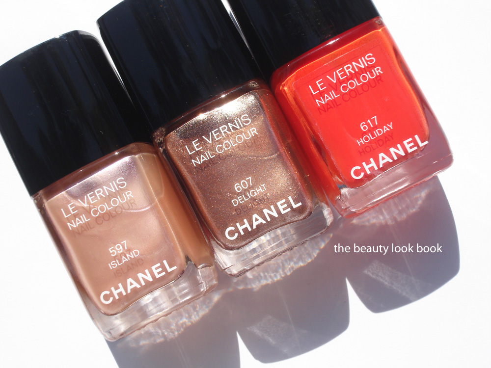
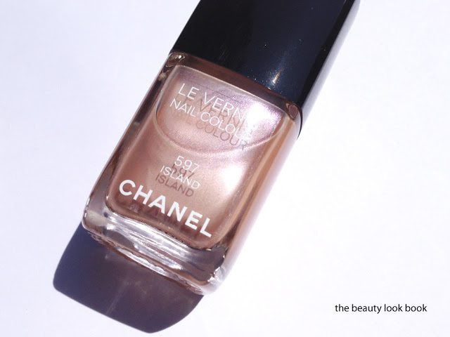
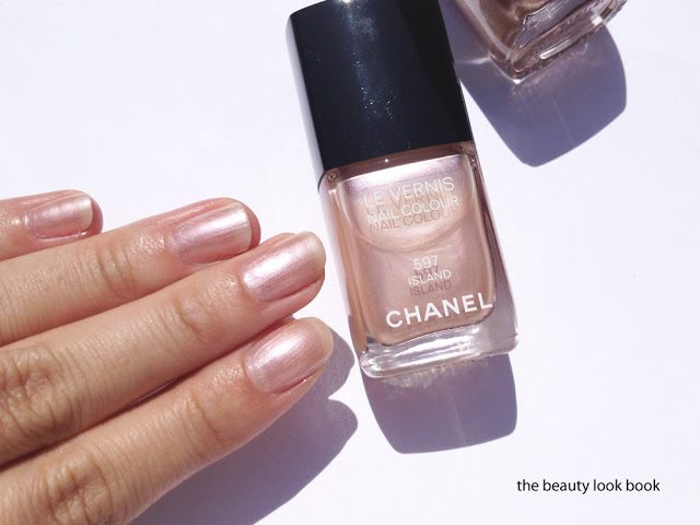
Chanel Island #597 is a soft opalescent pearly beige that flashes some seashell pink. It has a sheer see-through finish, but glides on smoothly and evenly with 2 coats. It reminded me of an older nail polish Angora, but when I swatched them side-by-side, I found Island to be more pinkish. This color makes the fingers glow with a subtle but natural sheen. It’s reminiscent of the long-discontinued Island single eyeshadow (which I wish they would bring back). If you’re looking for a gloss to match this perfectly, it seems Seashell would be a close match.
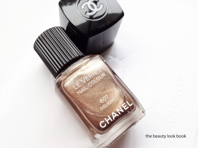
Chanel Delight #607 is the color I was anticipating the most. It’s a high-sparkle complex bronzey-gold. I found that it has a similar finish to that of Graphite (sheerish base loaded with sparkles and highly metallic). However, the first coat is much much more pigmented than Graphite or even Gold Fingers. On the nails the pale-neutral-gold shimmers stand out. For me, it looks like a pale gold rather than a bronze on the fingertips. I’m sure there are similar shades from OPI (I’m thinking something from the Muppets collection or a warmer version of Glitzerland, possible close to China Glaze Swing Baby), but I usually miss out on most of the limited edition OPI colors. The finish is smooth with full coverage using 2 coats. There is no gritty feeling even with all the sparkles. It’s nothing like anything else Chanel has released. In the bottle it looks warm, on the fingers it’s a neutral-warm metallic. (Note the color changes depending on the angle and the way the light hits the metallic particles in bottle, sometimes it looks more bronze, other times more golden.)
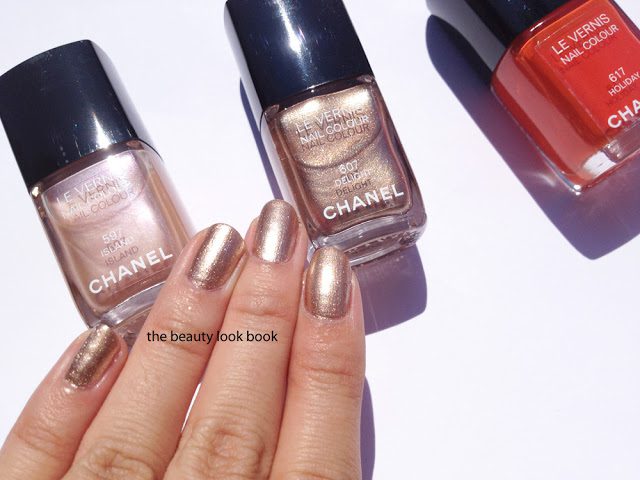
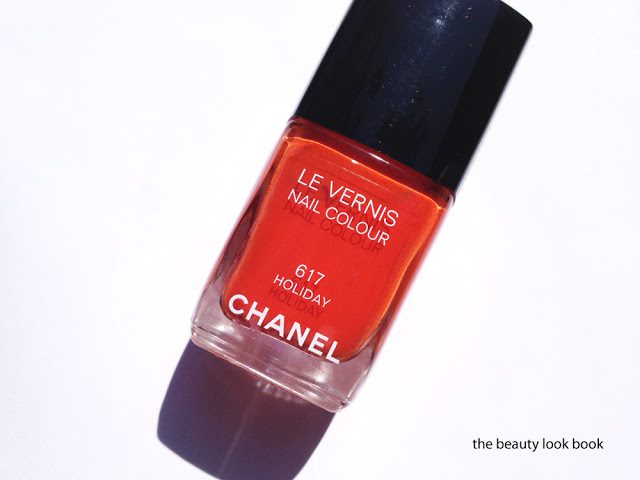
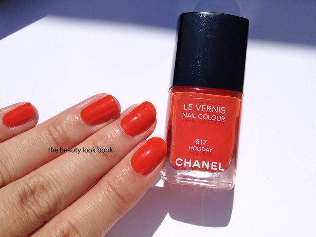
Chanel Holiday #617 is an orange-coral. Coral is a hot shade this year and with so many brands releasing coral shades, many have asked me, “how is this one similar/different?” I would say it’s close to last year’s Dior Aloha, but minus the jelly finish. Compared to this year’s releases, Chanel Holiday is predominantly orange. Most of the other corals have pink or red undertones. There is still some red in Holiday, but I’d say it’s more of a burnt-orange/coral blend. The first coat is sheerish but it applies smoothly and gives full coverage with 2 coats. I thought this might be similar to Enthusiast, but Holiday is quite a bit more orange.
Comparisons on the nail wheel:
I love these new colors from Chanel. I think they are all must-haves. They are wearable for work and everyday but edgy enough to not be boring or too neutral. I think these will sell out really fast, so if you’re considering these, I highly recommend you call your local counters sooner than later to see if they’ve received the summer items.

I was silly enough to think I didn't want any of these. Thanks to your beautiful shots I now think I need Delight and Holiday! 😛
I need Delight and Holiday too! Just beautiful!
Sold X 3! Thanks for the beautiful photos.
Beautiful shades! 🙂
I'm not sure if I'm won over by the nailcolours this time. I have my heart and wallet set for the bronzers though! Will you be reviewing these soon? I'm looking forward to your posts!
Could you please compare the Delight to Chanel's last year Quartz, which was in the Fall Collection? Tnx so much 😀
Nice pics 🙂
Yes, I'm working on this right now, will have a comparison post up as soon as I have a chance to load the photos 🙂
"Holiday" is very beautiful!
I love Holiday! Delight is nice but Island is sooooo boring!
Have anice day 🙂
Could you compare them to Chanel Quartz?
I will be getting holiday and delight. I knew I had to have holiday for sure! I can't resist: everything red, coral is right up my alley. I hope delight will work with my skintone but from what I can see, I will like it!
Like Perilously Pale, I too thought I didn't want any of these. WRONG! Thanks for the swatches, Sabrina!!
You're welcome Estelle 🙂 They really are prettier in person. Swatches/photos cannot do these justice.
great swatches as always! but I still think these new shades are really nothing special.. i own Chanel Gold Shimmer and i find it a much prettier version of Chanel Delight – but that's just my opinion! 😉
How it compares with Sizzle of LAura Mercier??? It's hard to see a difference in the pic….
Holiday has more orange with more opaque coverage. LM Sizzle has more red with a jelly finish. They are extremely similar.
Thanks for the hard work! I <3 Delight!!!!
<3 Holiday— what an interesting tomato red; seems like the perfect ripe (and bold) color for summer
Yes, a perfect ripe tomato red, until you swatch it next to a pure red, then it's more orangey 🙂
I like all three! Holiday is simply gorgeous! Thanks for posting 🙂
Love the shade of Holiday…perfect for Summer!
Is Holiday a limited edition?
I am quite simply jealous over here in the UK. We are only getting Roses Ultimes de Chanel collection on May 11th and goodness knows if we will even see this collection. I cannot understand why we have to wait so long for a collection that is already available. It is very frustrating.
Anyway, you make them look amazing!
Island is beautiful. It reminds me a little of Chanel Trapeze, but on the pink side instead of the golden yellow. Your nail wheel makes me think I might need Distraction after all. *sigh*
Will Holiday be a limited edition aswell??
i am a massive chanel nail polish fan and you have done an amazing review – i now can't decide between island and delight! too many people don't put pictures of the varnishes actually ON their nails. but there is one colour you missed on the colour wheel – Dior's Aztec Chocolate 😀